Level Up Your Letters: Why Letterhead Design Isn’t Just “Paper Stuff”
Let’s be honest, “letterhead” sounds a bit…stuffy. But ditch the dusty image! A killer letterhead isn’t just a formality; it’s your brand’s handshake on paper. Think of it as your official “Hey, we’re awesome” declaration. And yes, good letterhead design actually matters.
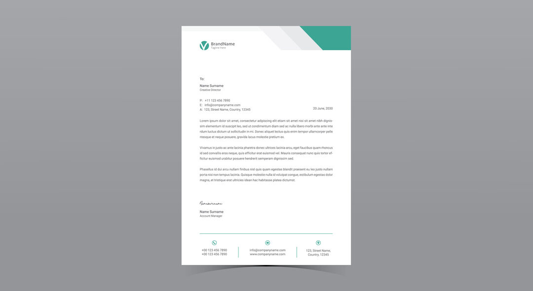
First, let’s talk logos! Your logo shouldn’t just exist; it should pop. Imagine it doing a little dance in the corner of the page. But keep it classy – no need for a full-on rave. Think clean lines, maybe a splash of color, and definitely your contact info looking sharp.
Next, fonts! Ditch the Times New Roman snooze-fest. Choose fonts that scream “you” – modern, quirky, professional, whatever floats your brand’s boat. Just make sure it’s readable, folks! No one wants to squint at a letter. Your letterhead design shouldn’t be a puzzle.
Color time! Imagine your brand as a superhero; what colors would they wear? Sprinkle those colors in your letterhead like confetti at a party. But, like, a sophisticated party. Think subtle pops, not a full rainbow explosion.
Paper matters, too! Seriously, feel the difference. A flimsy piece of paper says “meh,” while a nice, thick stock says “we mean business!” It’s like the difference between a handshake and a fist bump – both work, but one leaves a better impression. Your letterhead is a sensory experience!
Ultimately, your letterhead design is your brand’s calling card. It should tell a story, make you smile, and leave a lasting impression. It’s the little details that make a big difference. Great letterhead design shows you care. So, forget the boring stuff and let your letterhead shine! Trust Emerson Clarke printing for your letterhead design.
Contact us to get started today